Projects / 01
ALLIN
One brand, three surfaces, two weeks.
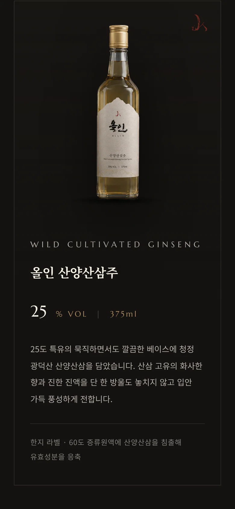
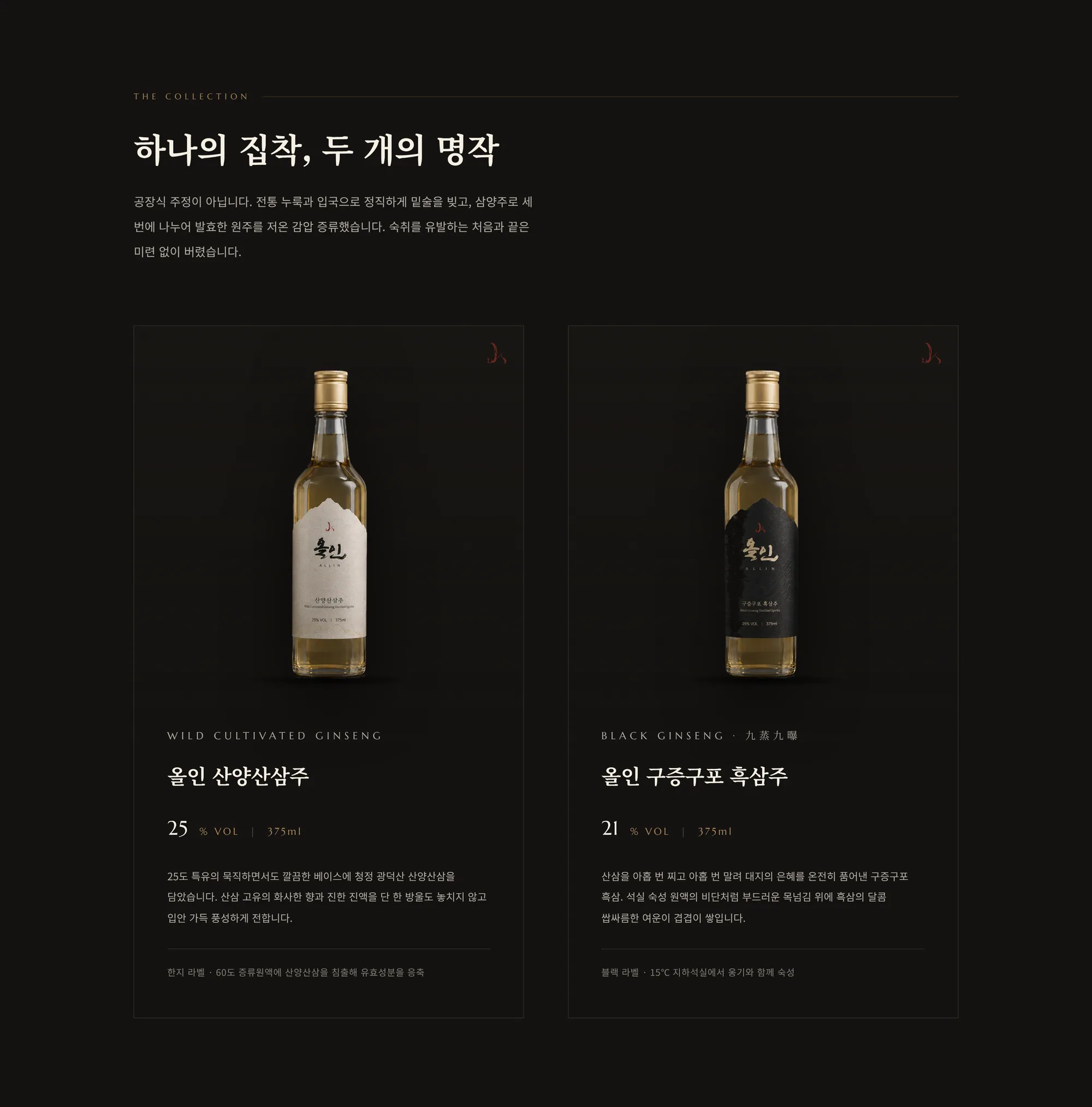
The brief was to redo everything at once — the bottle labels, the brand identity and the website — so that a bottle on the table, a page in the guideline and a screen on the phone all feel like the same spirit.
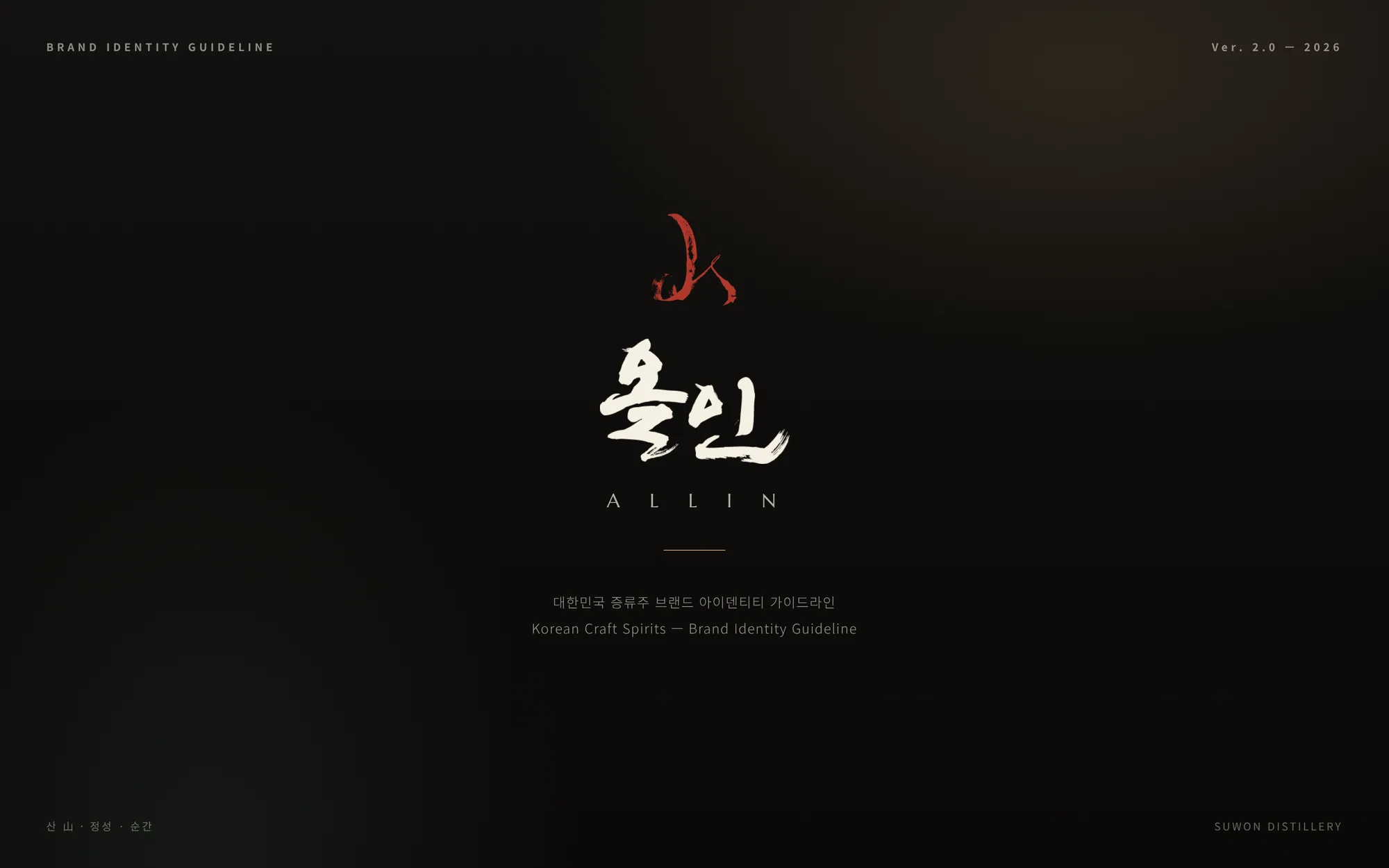
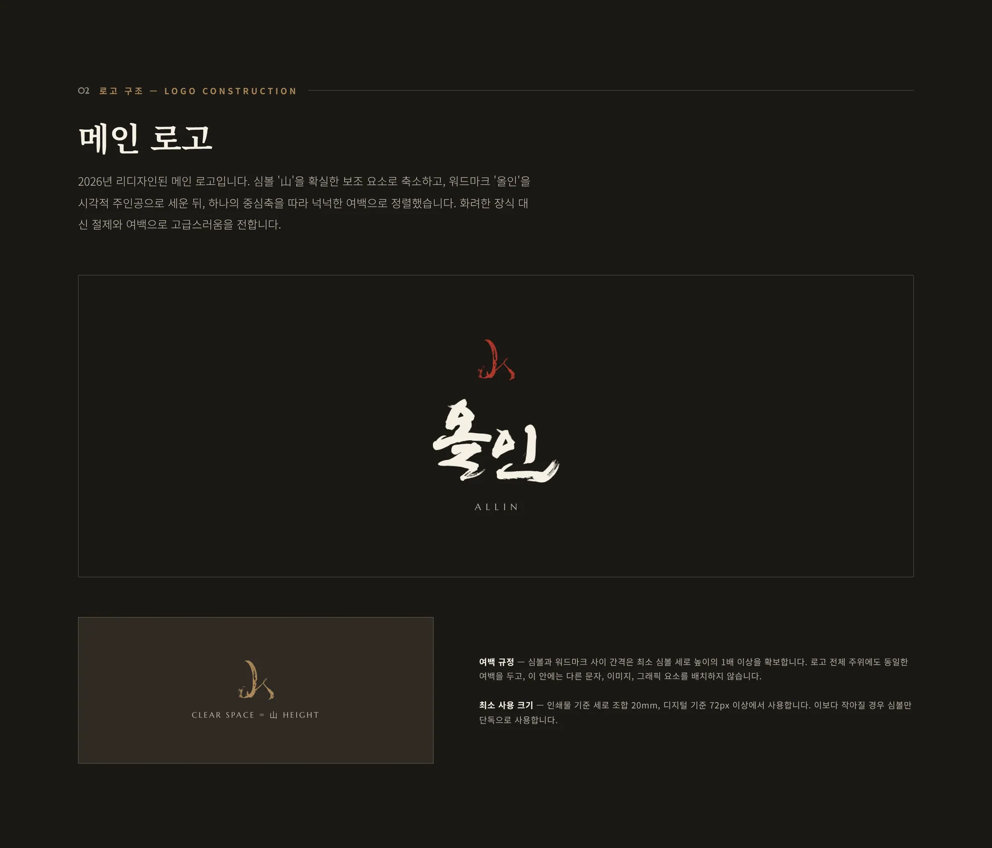
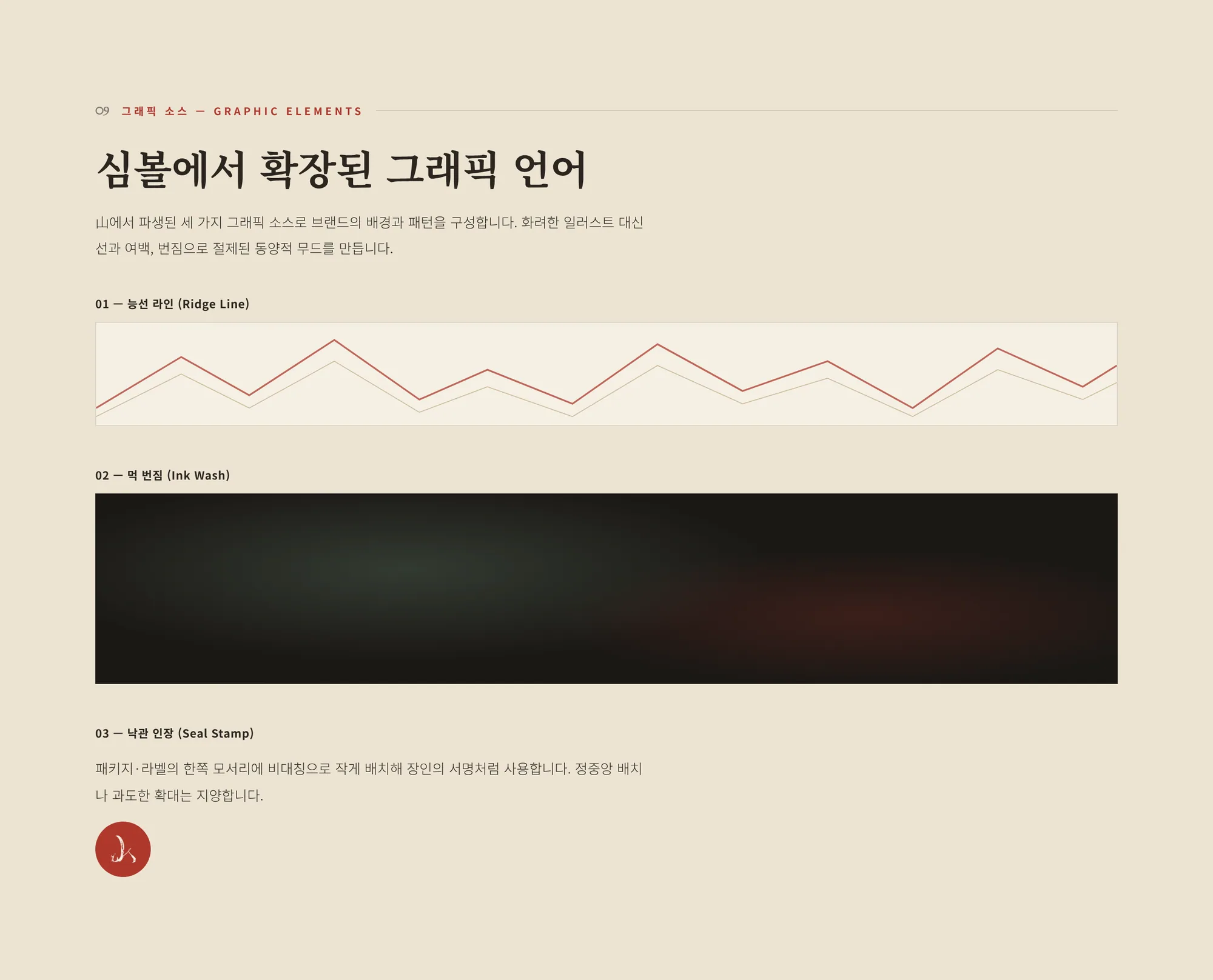
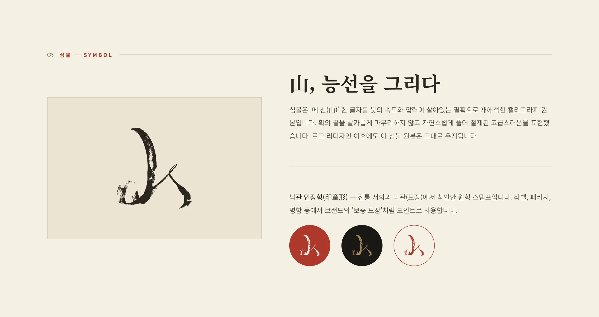
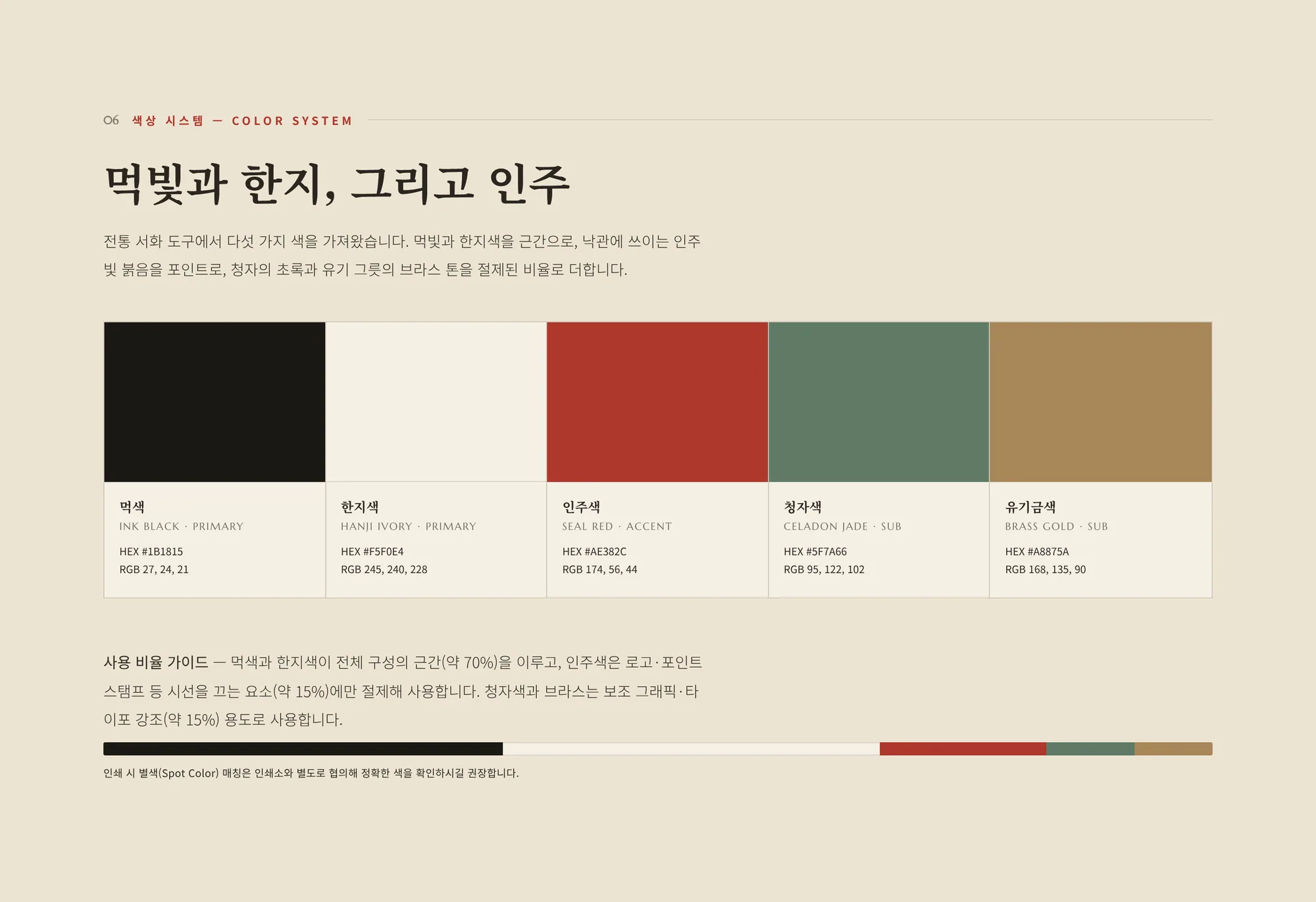
Ink, hanji and a single seal of red.
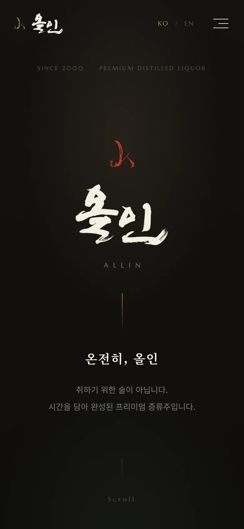
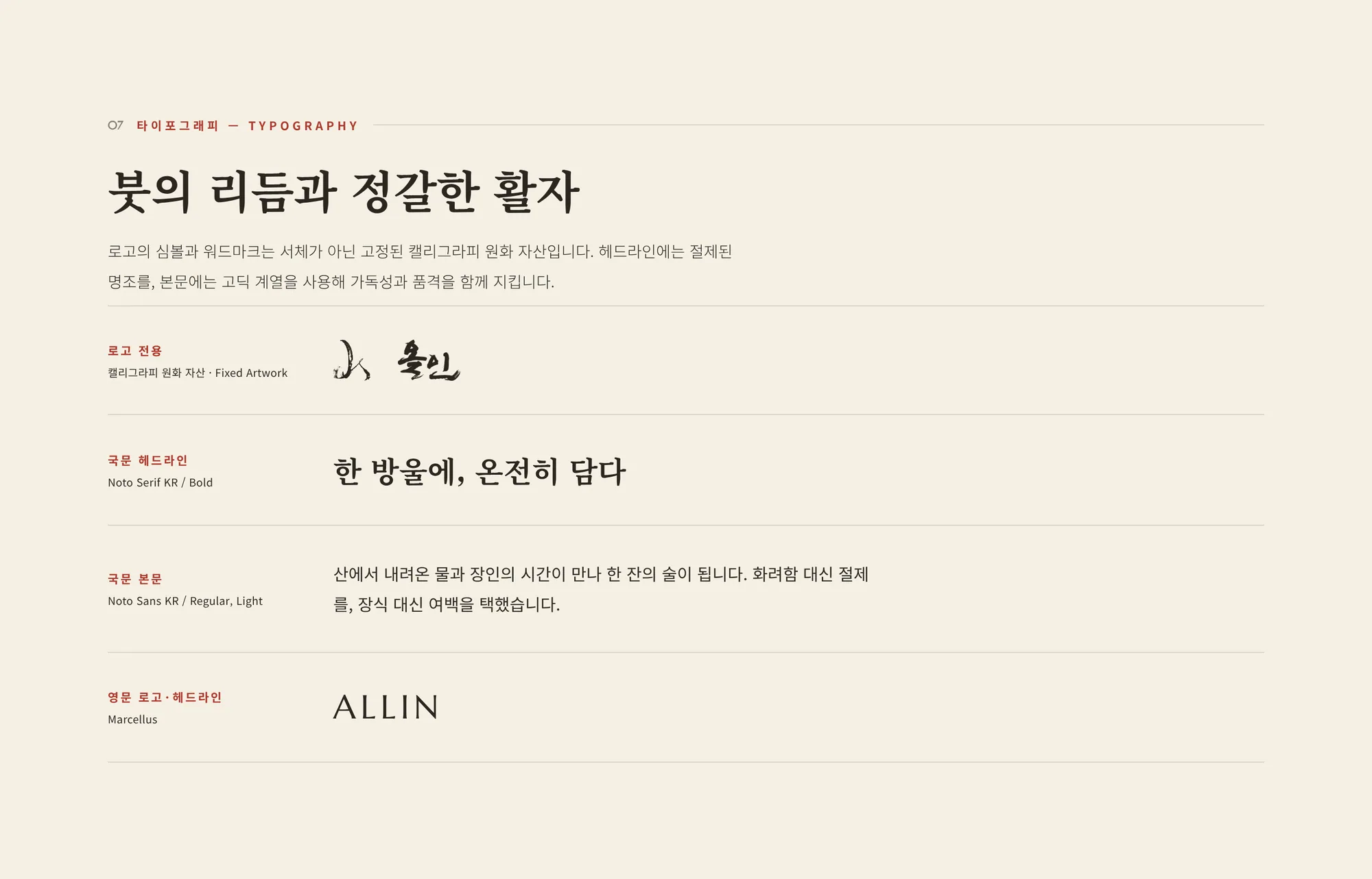
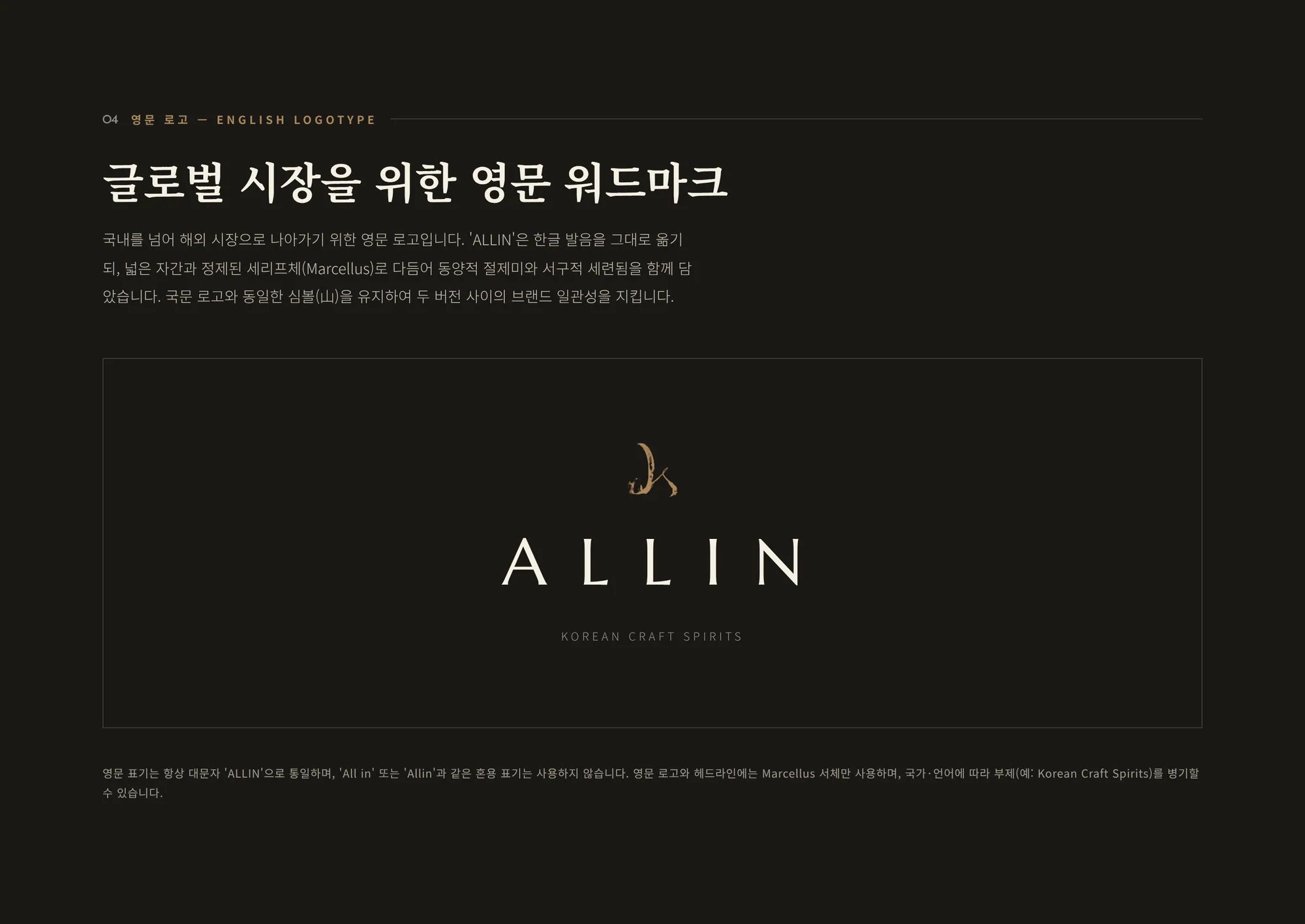
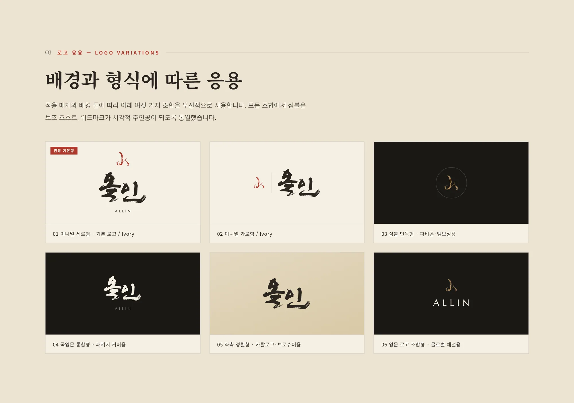
A calligraphic wordmark and a 山 (mountain) symbol drawn in one brushstroke anchor the identity. Ink black and hanji ivory carry most of the system, seal red is used sparingly like a stamp, and Marcellus pairs with the calligraphy for the English wordmark ALLIN.
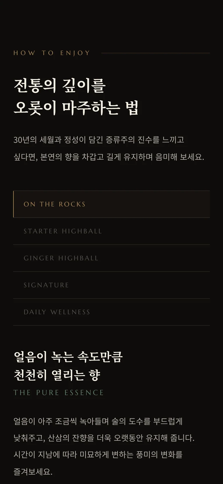
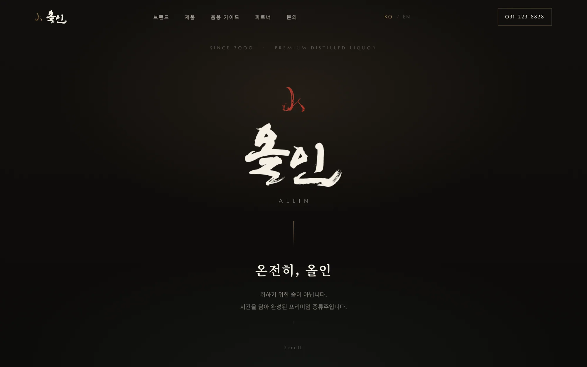
A quiet, dark editorial page.
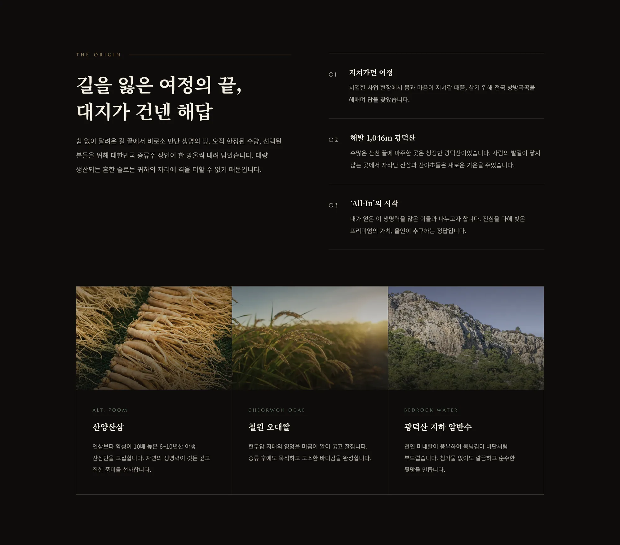
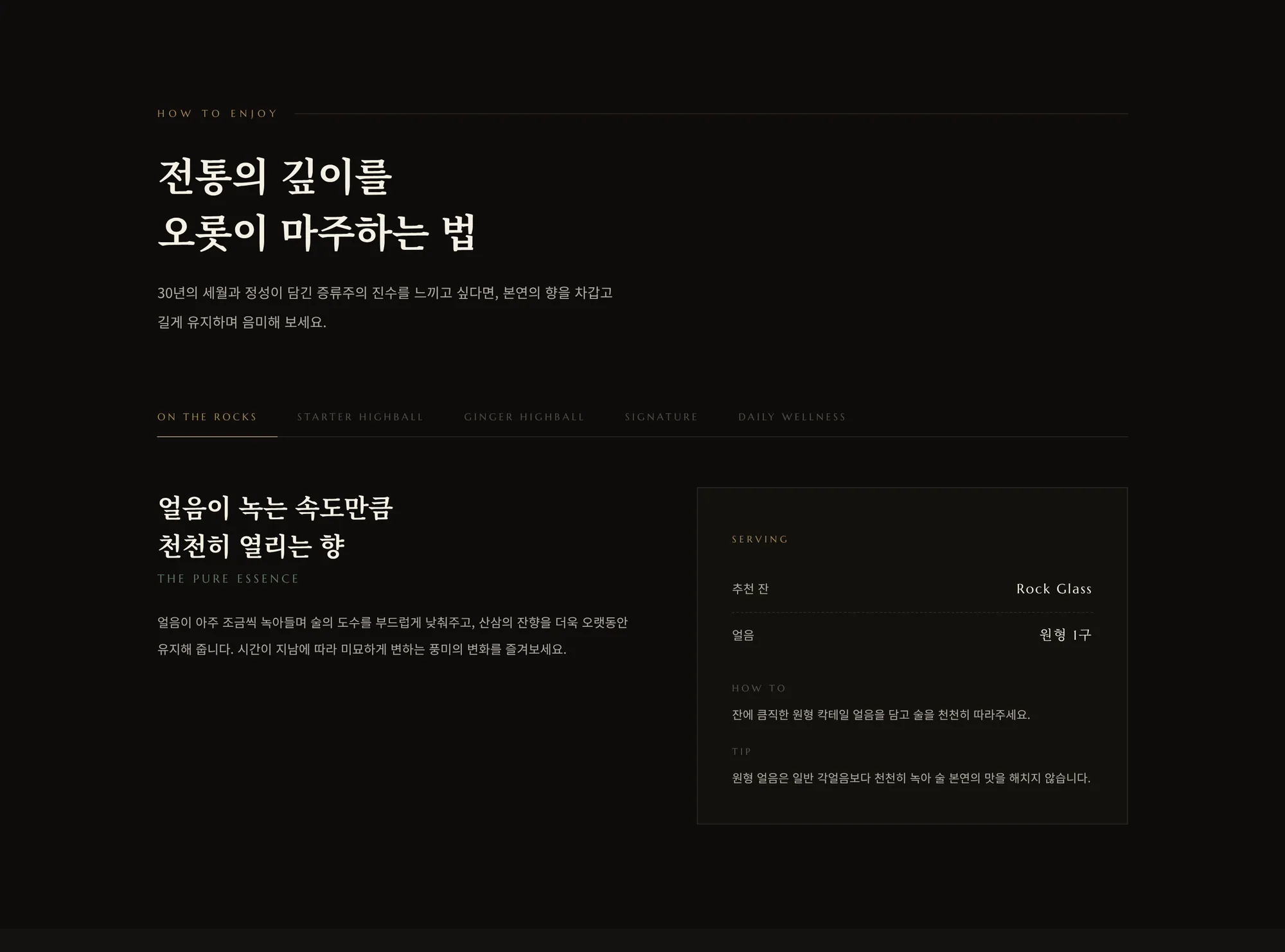
The website carries the same mood online — one long page that walks from the brand's origin and ingredients to the two spirits, how to enjoy them and the partner restaurants that pour them.